Sunday, September 30, 2012

What Your Eyes See - A Devotion for My Children


My son (8 years old)

I have been looking for a devotional book to use each morning with my children, before they go off to school.  There are so many great books, but I was looking for something very specific to address some tough topics.  Since I can't seem to find what I am looking for, I decided to write my own.  I am sharing it with you, in case you wish to discuss this with your own children
 
What Your Eyes See
 
What are some bad things your eyes see?   What do we say if something pops up on TV or on a billboard that we don't think is appropriate for little eyes?   Usually we say, "Close your eyes," because someone is 'naaakid' (naked) or a boy and girl are kissing and they aren't married, right?  
 
 Does our curiosity sometimes make us keep looking?  Is curiosity a bad thing?  No, curiosity helps us learn.  Kids are naturally curious and that is how kids learn to do lots of things and how they learn about the world around them.  Curiosity about the wrong things is what we want you to avoid.  What does the Bible tell us to do?
 
David and Joseph and What Their Eyes Saw
(2 Samuel 11:1,2 and Genesis 39:6-12)
 
During a time when kings usually go off to war, David stayed home.  One evening, he went for a walk on the roof of his palace.  From the rooftop, David would have had a commanding view of Jerusalem.  While walking around, he saw a beautiful woman, named Bathsheba, taking a bath.  Do you think she was clothed?  Unless you were wealthy, you might not have had the luxury of privacy.  Many people had to bathe on their rooftops.  Bathsheba was most likely naked. Once David saw her, he had a choice.  He could flee and turn his eyes away or he could choose to look at this beautiful, naked woman.  David was 'a man after God's own heart,' but in a momentary pause, in an otherwise righteous life, David made an impulsive decision.  He chose to look at her and to send for her (the eyes of man are never satisfied.. Proverbs 27:20,) and it meant that many lives would be devastated and even destroyed. 
 
  What was David doing that caused him to be idle or restless?  David was supposed to be off at war.  He was supposed to be fighting with his men.  Proverbs 18:9 says, "One who is slack in his work is brother to one who destroys."  Sometimes when we are idle or restless, we are vulnerable to sin.  When we are bored, the devil is happy to provide some deceptive thrills!  What should David have done and what are we to do when something is 'before our eyes' that might show people in skimpy clothes or without any clothes?
 
There are two things we should do immediately: 
1. Flee, run and 'turn our eyes away'
2.  Pray, cry out to God
 
Most men of that day did not have a rooftop access like that of the palace to view the world below or of women bathing on their rooftops.   Did David go up to the roof, because he knew he might catch a glimpse of a woman bathing?  Or was he innocently taking an evening stroll on the rooftop and thus, put himself in a tempting situation?  We don't really know.  What we do know is that David made a choice to look; to stare and to not turn away. 
 
This access to view a naked woman may have been readily available to only king David; however, this same sin, is readily available today, via the internet, for any man or woman, boy or girl by the few clicks of a button.
 ~
 Joseph was in charge of Potiphar's household.  Everything Potiphar had was entrusted to Joseph; everything except Potiphar's wife.  Joseph honored his master.  He was busy with work; he was 'attending to his duties.'   He wasn't bored or restless looking for some misguided excitement.  Potiphar's wife thought Joseph was handsome.  In trying to get his attention, it is possible she walked around in slinky clothes or possibly in no clothes at all!  She tried very hard to lure him and to get him to notice her.  Joseph said, "How could I do such a wicked thing and sin against God?"
 
Potiphar's wife continued to try and lure Joseph, so Joseph refused to even be around her.  One day, as he was going about his duties, Potiphar's wife grabbed Joseph.  It is possible that she was wearing very little or no clothes at all!  What did Joseph do in that split second he had to make a choice?  Did he look?  Did he consider staying with her?  No, in less than a second, he turned and ran!  Because she had grabbed him, as he turned to run, his coat came off!  He didn't try to reason with her, nor did he go back for his coat; he ran!  Joseph chose to obey God and flee the situation, and he made this choice immediately.
 
What do you think about these two men?  Do we ever seek out and choose to look at something we know we shouldn't?  Do we ever put ourselves in situations, where we know we might see something inappropriate?  What if we don't seek it out, but it is placed right before our eyes?  Where are some places we might see some naked people? (TV, movies, billboards, Internet, magazines, etc..)  'Nakedness' is not bad, but sin in the world distorts and has made ugly what God meant for beauty. 
 
'Put on the full armor of God so that you can take your stand' and turn away or flee the situation and pray.  If someone doesn't have their clothes on, whether on a billboard, the television, a computer or a phone,  you shouldn't look, but quickly turn away! (Ephesians 6:11)
 
Memory Verses

I will set before my eyes no vile thing. ~Psalm 101:3
Turn my eyes away from worthless things, preserve my life according to your word. ~Psalm 119:37
Death and destruction are never satisfied, and neither are the eyes of man. ~Proverbs 27:20

 
 We have blocks on our computers, televisions and phones.  We use a free service called K9 Web Protection.  While there have been a few exceptions, we typically do not let our children spend the night with friends.  The statistics are too staggering and at such young ages, we are not willing to put them into situations where they can't readily 'flee.'
 
Statistics
 Some researchers have stated that the average age of exposure to x-rated images is down to eight. Before the days of the Internet, children were typically between the ages of eleven to thirteen when they first viewed soft-core pornography found in magazines.  Today's child lives in a culture where it isn't just a picture of a naked person, but images of a sinister and hard-core nature. Our children are being seduced daily.  After writing this, I took my six year old to the mall.  I made a point to pay attention to what was in the store front windows, as well as, on the large posters in some of the stores.  Some of the advertisements are of children scantily dressed!  Other stores show near naked women or skimpy lingerie.  In the past, I hadn't given these things much thought.  These images are so common everywhere, I had become numb to them.
 
One statistic showed that 90% of children age 8-16 had seen inappropriate images online, while they were doing their homework.  The x-rated industry is larger than all major networks combined.  There are 26 children's character names (ex. Pokemon and Action Man) linked intentionally to inappropriate sites.  Often a misspelled character's name can take your child directly to an x-rated site.  This industry targets our young children.

Even though this is a heavy topic,  consider discussing it in a way that shows God's truths and in a way that is age appropriate.  As parents, we have to consider these statistics and prepare their eyes and their hearts for the battle ahead.  As our children grow, we will discuss these stories about David and Joseph in more detail.  For the purpose of discussing 'what our eyes see', we limited the details.


resources: NIV Bible, Bible.org, Focus on the Family, Toptenreviews.com


I hope you have a blessed Sunday!


Friday, September 28, 2012

Favorite Photo Friday


Delicious autumn! My very soul is wedded to it, and if I were a bird I would fly about the earth seeking the successive autumns.

~George Eliot
 
My favorite photo...ahhh, the colors of fall!

Tuesday, September 25, 2012

The {{Complete}} Kitchen Remodel

Complete...that is my new favorite word!  The first several photos are of full room views.  If you are interested in the details keep scrolling down.  Also, the 'before' pictures are at the end.  Either way, let me know what you think!  'Complete' is a sweet, sweet word!
 
 The cabinets in the kitchen before the remodel were white. I chose white again, because with the dark ceilings and floors, I thought it might feel like a cave in here with anything darker. The trim around the windows and molding is also white, so it seems to work.
  
For the most part, the footprint of the kitchen stayed the same.  We did move the microwave from above the stove to another space that works much better.  Also, I am debating about whether or not to hang the old wooden brick mold (sitting on the back of the stove) above it to hold spice jars.  I don't want to drill the holes through the backsplash until I am sure!
 
The microwave was placed above the dishwasher.  This positioning has worked much better.  We debated about putting it in the island, but ultimately decided, based on our routines, it would work best for us in this location.
 
 When I say, 'complete,' I guess it is not really complete.  I still can't decide what to do with the windows!  We love all the light streaming in, but the sun is so bright, it will quickly fade everything if we don't hang curtains or shutters.  Brown transferware and pewter plates hang above the vintage fishing creel and a French bread basket on either side.
 The sink in the bar is the same sink we had before.  It was mounted over top in our previous kitchen, but we were able to have it under-mounted.  We changed out the metal sink drain and it looks brand new.

 The bench was widened and double drawers placed underneath for storage.
 The Swedish pine bench serves two purposes; extra seating and storage.  The bench holds all of our art supplies. The early 1900's decoy came from New England.  This lake is home to lots of ducks and geese, so he fits right in.
 We opted for a black island to transition from the cooking space to the dining space.  The French-style chairs are painted black and are distressed, so I had the island painted the same way. 
 We enlarged the island and pushed it back to allow for more user friendly space around the stove and sink.  For the 'dead' space on the back of the island, we had these shelves made to hold the sea of cookbooks and party supplies.  The doors have a push touch mechanism to open, so they don't appear to be cabinets.  This has been a great use of this, otherwise unused space.
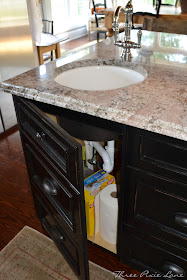
The space under the bar sink would have been practically useless if actual drawers were put here. We had our trash can in this location before, but with the under-mount sink, the space became limited.  A door, made to look like drawers opens the same as the other cabinets.  Here, I keep trash bags, paper towels and cleaning supplies.
The trash can was moved by the sink and is deep, so it can hold two trash cans.  This has been much more practical and efficient.  The trash can in the back of the drawer holds recycled items.
This was another great use of space.  The spice 'drawer' is now in this narrow space next to the stove. 
The other pull-out 'drawer' to the right of the stove holds cookie sheets and cutting boards.  To read more about induction cook stoves and why we chose it, click here.
This outlet is a new feature to the island.  I requested it, because during the holidays, we are all huddled around the stove and the outlets right beside the stove, trying to get our holiday dishes ready.  If someone needs to carve a turkey, they can take it to the island (and move away from my stove!)
 
 This counter flush refrigerator also allows for more room.  Before, if the refrigerator door was open, no one could walk by because of the island.  The ice maker never worked in the old frig, so I am glad to finally have one that works.
This sink is huge and super heavy!  It took four grown men to get it in place.  We had many challenges, since the sink sits in an angle.  There was hardly any room for the trash can drawer to open.  This caused part of my delay in posting this remodel, as we had to have the cabinets re-sized several times.  Remodeling is much harder than starting from scratch!
 
Because we have a well, we use a reverse osmosis system to have good drinking water.  The far right faucet allows for this.  We also included a soap dispenser on the left.  I chose the faucets and sink for their timeless style.
The pewter sugar cup offers a pretty place to hide an unsightly scrub brush.  I found the vintage stone soap dish at a flea market.  I wrapped a bunch of soaps in pretty fall craft paper for the bathrooms and kitchen.  The patina of copper and pewter are my favorites in any space.
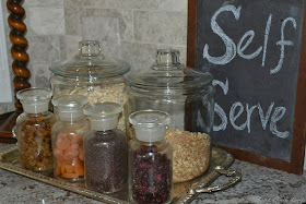
Behind the oatmeal and granola bar is a light switch.  My husband took a tile of the limestone to Home Depot to match the paint.  He painted all the switch plates and to my surprise, did a really good job!
  This old beer crate from England holds utensils for cooking beside the stove.
Admittedly, my mom's butcher block is a tight fit in this kitchen; however,  I was determined to use it.  I wish someone had taken a video of Rob, the three kids and me hoisting this several hundred pounds of solid wood to its current spot.  We used cinder blocks and boards to lift and position it.  To see the post about this butcher block and how I refinished it, click here.
With lots of family in town, we often gather in the kitchen.  We added these wing back chairs for extra seating.  I fell in love with this brownish-gray and cream check fabric.  Many of the Swedish homes that I love use check fabrics somewhere in their home.
I also love the muted red, green and brown colors of this Oushak rug.
 
 This towel rod is actually a refrigerator door pull. I chose it because it sits more flush to the cabinet than a regular towel rod, and I like the simple design.

 
I have a third matching bar stool, but for now, my youngest child likes to sit in this vintage high chair, because it makes her taller than the other kids.
 
The biggest challenge I faced in this entire remodel was picking a counter top.  Natural stone is beautiful and there are so many different choices and colors.  I called it my 'beautiful nightmare,' because the slabs are all beautiful, but it was a nightmare trying to find the right one.  Ultimately, I chose granite in 'Ecuador White' because of the gray shades and earthy tones.  It has gray to match the back splash, brown to match the hardwood floors and beadboard ceilings, and some black to coordinate with the island and black chairs.
This small pine table and chair are for my youngest daughter who loves to color.  To camouflage the temperature control box and the light switch on the wall above, I hung a few frames, a chalk board and some antlers.  These odd items grouped together seem to distract from the unsightly switches and box.
 
An old French market basket is used to create a centerpiece for my table with hydrangeas from my yard.  Corn, wheat, cattails, grapevine and large dried mushrooms fill the basket, too.
 
 
Before...
 
 
My old kitchen has been one of my most popular posts!  With several broken appliances and a desperate need to refinish the floors, we gave the space an updated overhaul.  The cabinets in here were not very well made.  To see the post on this kitchen, click here.
Rob removed the old cabinets and we had all the floors upstairs stripped and refinished.
 
 Stove and microwave: Viking
Dishwasher and refrigerator: Bosch
Granite: White Ecuador
Custom Cabinets: Knot Yet
Dining area rug: Rug & Home
Oushak rug: Traditions Interiors (Charlotte, NC)
Wingback chairs and bench cushion: Hancock and Moore with Cooper Natural fabric via Traditions Interiors
Farmstyle apron sink: Shaws Fireclay Sink (Rohl)
Sink faucets: Perrin & Rowe
Light Fixtures: Landmark Lighting and Thomasville Lanterns by Progress Lighting (I wrote about light fixtures here and my Pinterest board on light fixtures here.)
Barstools: World Market
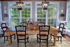
Farm table and chairs: Victoria and Thomas (purchased years ago)
Striped dish towels on island: West Elm
Floors: Reclaimed pine floors finished in Min Wax English Walnut
 
 
 Thank you so much for stopping by!
&
Thank you ladies so much for the features!  What a sweet, sweet reward for all the work we devoted to this kitchen and were forced to live off pizza and fast food for months!

My Uncommon Slice of Suburbia  mop it up mondays feature  Photobucket   


I plan to link here! 
 
mop it up mondays Keeping It Simple ”Between The Girl Creative Boogieboard Cottage My Uncommon Slice of Suburbia Cedar Hill Ranch Cozy Little House Jayson and Ashley Sugar Bee Crafts Coastal Charm A Bowl Full of Lemons  Savvy Southern Style {Primp} 36th Avenue Furniture Feature Fridays Chic on a Shoestring Decorating Redoux vif187 The Shabby Nest bws tips buttonFunky Junk's Sat Nite Special 
Fall Decorating Ideas | The Lettered Cottage